
Ok, if you let me I would like to start this edition of Cover Wars a little differently, seeing as Wednesday is a day for book cover in this blog I thought maybe you guys would enjoy a pick at how Jennifer Rush's Altered cover shoot
.
When you can’t trust yourself, who can you believe?
Everything about Anna’s life is a secret. Her father works for the Branch at the helm of its latest project: monitoring and administering treatments to the four genetically altered boys in the lab below their farmhouse. There’s Nick, Cas, Trev . . . and Sam, who’s stolen Anna’s heart. When the Branch decides it’s time to take the boys, Sam stages an escape, killing the agents sent to retrieve them.
Anna is torn between following Sam or staying behind in the safety of her everyday life. But her father pushes her to flee, making Sam promise to keep her away from the Branch, at all costs. There’s just one problem. Sam and the boys don’t remember anything before living in the lab—not even their true identities.
Now on the run, Anna soon discovers that she and Sam are connected in more ways than either of them expected. And if they’re both going to survive, they must piece together the clues of their past before the Branch catches up to them and steals it all away.
Now then shall we take a look at this weeks contestans??
First we have the ARC edition, the fearless one that for some lucky bloggers was the first face they knew for Altered and may now and forever old a special place in their hearts:


a Rafflecopter giveaway
First we have the ARC edition, the fearless one that for some lucky bloggers was the first face they knew for Altered and may now and forever old a special place in their hearts:
\

Next we have the face that yesterday hit the shelves of all bookstores in hopes of one day jumping into your shelf, we have the one and only FINAL cover!!!

I fell that the purpose of the ARC cover is to over shadow every cover within viewing distance it just catches your eye, then you dig a little deeper and look into the guy's eyes and I see a tenderness in his eyes and I just feel that he is looking at Anna in a moment where she doesn't realize he is watching a moment just for himself.
In the FINAL cover on the other hand is making me feel like I am looking at the back of a strong guy, one that even if he can't remember his past or anything outside the lab, he will make up in conviction and stay strong until he can no more. The effect on the font at how the words almost fit makes a perfect contrast with the word that the letters are spelling.
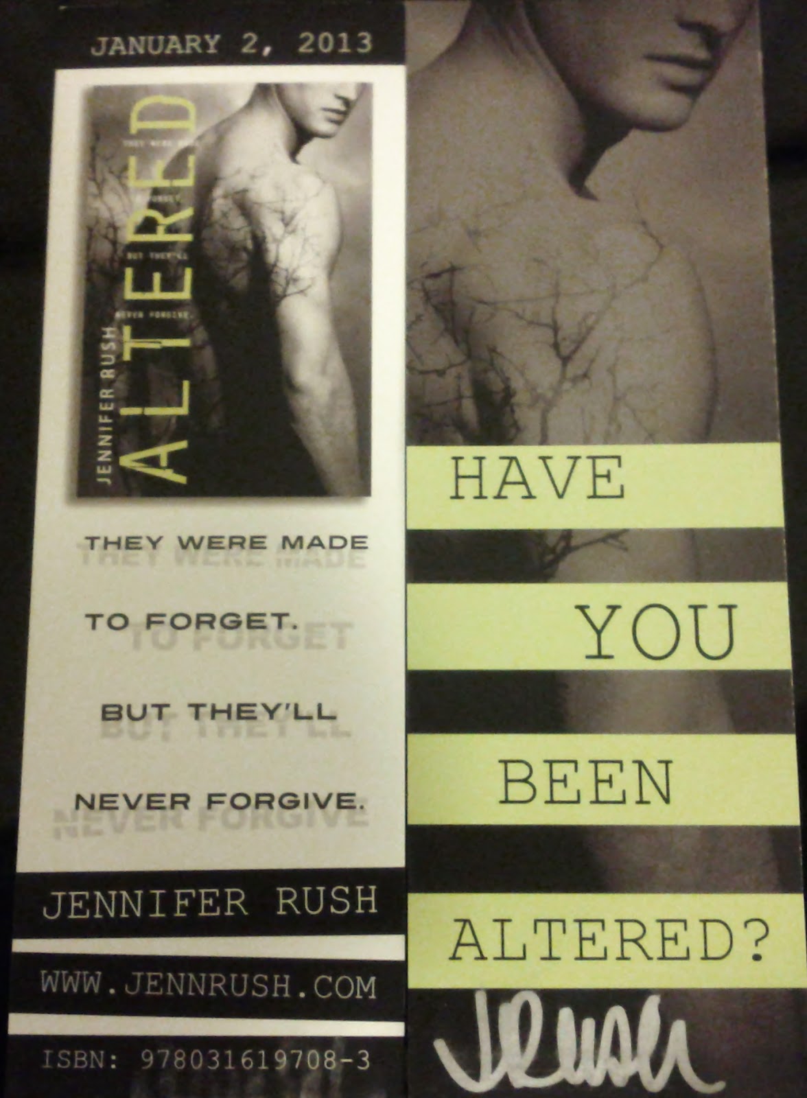
Author Jennifer Rush was really nice, she gave me two bookmarks to give out to you guys!!!
Rules
*US only
*US only
*Winner has 48 hours to reclaim price
if he/she doesn't a new winner will be
picked.
On one point, I really like the new cover, because I like the leafy thing that's on his skin-- it looks REALLY cool. But on another point, I like the original ARC cover, because it looks very simple, even though I'm not a fan of the title dealio. Does that make sense? (:
ReplyDeleteThe weird green creepy shadow dealio. It's like sneaking up on that dude! o_O AND REACHING OUT FOR HIM. EEE! O-O
ReplyDeleteI like the final cover the best.
ReplyDeleteRafflecopter name: April
I like the first one best
ReplyDeleteOmg! Those bookmarks are amazing.:DDDD I actually like both of them, but I really like the final one though!
ReplyDeleteOh.... I kinda like both of them XD I like the first cuz you can see his face and the dude's cute but I like the second one cuz of the tattoo/branches on his back :)
ReplyDeleteI love the look he is giving in the original and yes, those branches give it a little somtething
ReplyDeleteI like the second one. Not seeing his whole face adds to the mystery hot guy image.
ReplyDeleteI like the second one better because of the branch-like thing going up his back...I don't know how else to describe it!
ReplyDeleteThe second one, the first one seem a bit cheaply Photoshopped :/
ReplyDeleteThe second one because I like the design on his body.
ReplyDeleteI loved the first one, but I love the second cover even more. I kind of like that we can't see the boys face anymore, just a slight profile. It adds to the mystery! Besides, we still see a shirtless male! YUM! :)
ReplyDeleteyes, you are right and by not seeing his face you can imagine is face anyway you wanto to and those abs yes, YUM indeed
ReplyDeleteThe finished cover is my favorite because it oozes this mysterious vibe from it, the first cover makes me think it's a contemporary novel when it isn't and the yellow design is too distracting whereas the second cover is more aesthetically pleasing with just the right amount of attention drawn to the image. Also I love the text placement it's perfect. I look at the finished design and it screams intriguing science fiction novel - read to unravel the secrets within.
ReplyDeleteYes it does scream " intriguing science fiction novel - read to unravel the secrets within" Thank you for sharing such an elaborated answer, you really analyzed them.
ReplyDeletehmmm, this one is HARD!! I think i like the FINAL cover more. I mean the original was simple & nice but the final one seems more creepier & i LOVE the font treatment with the tagline in-between Plus liketh the model pose more tehe =D
ReplyDeleteYes, the creepy factor makes you wonder more about what is hidden behind that cover
ReplyDeleteI love the second one :)
ReplyDeleteit's more mysterious isn't it?
ReplyDeleteAhhh when you put it that way, yes it is creepy looking o.O
ReplyDeleteOf the font they used?? or the title in general??
ReplyDeleteThank you for commenting :)